LinkedIn Banner Size: The Complete Guide to Getting It Right
Learn the correct LinkedIn banner size, recommended dimensions, design tips, common mistakes, and tools to create a professional LinkedIn background banner.
InstaInker Team
InstaInker
Ask someone what the most important part of a LinkedIn profile is, and they'll probably say the profile picture.
They're not wrong.
But they're also forgetting something that's almost impossible to ignore once you land on someone's profile; the banner.
Think about the last few LinkedIn profiles you visited.
Some probably had a plain grey background or had blurry images that looked stretched.
Others immediately told you what that person did before you even read their headline.
That's the difference a well-designed LinkedIn banner can make.
It's one of the first visual elements people notice, yet it's often one of the last things professionals update.
Whether you're looking for a job, building a personal brand, attracting clients, or growing your business, your LinkedIn banner quietly communicates your professionalism before you've written a single word.
What Is a LinkedIn Banner?
The LinkedIn banner is the background picture that is displayed on the top of your LinkedIn profile behind the profile picture.
Whereas your profile picture is a representation of you, the banner acts as a representation of your brand.
In other words, the banner is your billboard of professional brand identity.
Your LinkedIn banner may feature:
- Your expertise
- Your industry
- Your business
- Your personal brand
- Your accomplishments
- Your message
The decision maker usually gets the first impression of your profile within seconds.
What Should Be the Ideal Banner Size for LinkedIn?
One of the common causes for banners appearing blurred is when users upload images having improper dimensions.
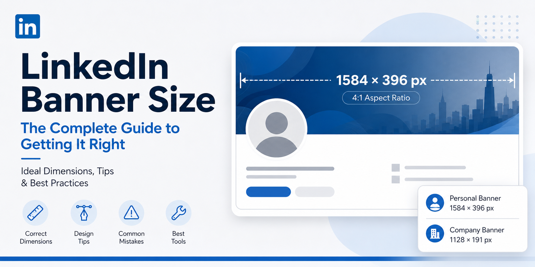
LinkedIn suggests a banner size of:
1584 × 396 pixels
This will give you an extremely wide 4:1 ratio which can perfectly fit your banner across desktop devices.
Optimum settings include:
- Recommended dimensions: 1584 × 396 px
- Aspect ratio: 4:1
- Maximum file size: 8 MB
- Supported formats: PNG and JPG
Using small banners often results in pixelated images, and incorrectly cropped banners can omit significant information such as logo or text.
Personal vs Company LinkedIn Banner: What's the Difference?
One thing many people don't realise is that LinkedIn actually has two different types of banners.
The first is the personal profile banner, which appears behind your profile picture and helps communicate your personal brand. This is the banner recruiters, clients, founders, and other professionals see when they visit your profile.
The second is the LinkedIn Company Page banner. Instead of representing an individual, it represents an organisation. Its purpose is different too. A company banner reinforces the brand identity of the business and helps visitors immediately understand what the company does.
Because these serve different purposes, they also have different recommended dimensions.
Banner Type
Recommended Size
Personal LinkedIn Banner
1584 × 396 px
LinkedIn Company Page Banner
1128 × 191 px
If you're managing both your personal brand and your company's LinkedIn presence, it's worth designing separate banners instead of using the same image for both. A banner that works well for an individual's profile usually doesn't translate well to a company page.
Why Banner Size Is not everything
Properly setting up banner dimensions is not all.
Sometimes banners that were technically the correct size but still looked unprofessional because the important information was hidden behind the profile picture.
Before designing your banner, remember that LinkedIn overlays your profile photo on the left-hand side.
That means logos, text, or important visuals shouldn't be placed there.
Instead, keep the left side relatively clean and move headlines or branding towards the centre or right side of the banner.
It's a small adjustment, but it makes a huge difference.
What Should You Include in Your LinkedIn Banner?
In truth, simpler is almost always better.
Your banner can have, depending on your objectives:
Value Proposition
Rather than just stating your job title, tell people what results you get for them.
Example:
"Aiding SaaS founders to create scalable sales systems."
Which will stick in their minds far better than: "Sales Consultant."
Brand Colours
If you run a business or are establishing a personal brand, use consistent colors on your website, LinkedIn profile, etc.
Minimalist Background
Do not choose too busy stock photos.
Minimal gradients, minimalist illustration, or design are usually more effective visually.
Social Proof
Alongside all the above, without making the banner too cluttered, you can feature the following:
- Author
- TEDx Speaker
- LinkedIn Top Voice
- Forbes 30 Under 30
- Trusted by 500+ Businesses
Only features that will boost your credibility.
Premium LinkedIn Profiles Can Use a Scrollable Banner
Another feature that's often overlooked is that LinkedIn Premium users have access to a scrollable profile banner.
Unlike the standard static banner, this feature allows visitors to scroll across a wider background image, giving professionals more space to showcase their brand, achievements, products, or visual identity.
This can be particularly useful for:
- Founders who want to showcase multiple products or brands
- Consultants highlighting different service areas
- Speakers and authors displaying books, events, or recognitions
- Creative professionals building a stronger visual portfolio
That said, the same principle still applies: keep the design clean and avoid overcrowding the banner. More space doesn't necessarily mean you should add more information. A clear message will always have a stronger impact than a busy design.
Common LinkedIn Banner Mistakes
One mistake I see repeatedly is treating the banner like an advertisement.
Too many logos, too much text and too many colours.
The result is a banner that's difficult to understand in just a few seconds.
Another common mistake is using low-resolution images downloaded from the internet.
Even if the design looks good, poor image quality immediately makes the profile feel outdated.
Finally, don't forget mobile users.
What looks perfectly aligned on a desktop screen may be cropped differently on a phone.
It's always worth checking both versions before finalising your banner.
Best Tools for Creating LinkedIn Banners
You don't need to be a graphic designer to create a professional-looking banner.
Several tools make the process much easier.
Canva
One of the best platforms to create LinkedIn banners, thanks to the available LinkedIn banner templates.
Pros
- User-friendly
- Many templates
- Drag-and-drop interface
- Free version available
Cons
- Popular templates might be too similar.
Adobe Express
Great choice for people who need a bit more freedom when it comes to design but don't want to use full Adobe applications.
Pros
- Professional templates
- Easy to customize
- High quality export
Cons
- Some templates available only on paid subscription.
Figma
Best platform for designers and companies that want to create custom LinkedIn branding.
Pros
- Complete freedom when designing banners
- Teamwork possible
- Great for custom layouts
Cons
- Requires design skills.
VistaCreate
Another great platform instead of Canva, offering many social media templates.
Pros
- Easy-to-use
- Modern templates
- Good free version
Cons
- Fewer templates than Canva.
Instainker
In contrast to other tools for designing a banner, Instainker provides profile branding from an entirely different angle.
As well as being helpful when creating LinkedIn content regularly, it also assists in optimising profiles via profile analysis, advice, content creation, scheduling, and branding processes.
This implies that the banner will be one component of a more efficient LinkedIn profile.
Do You Need to Update Your Banner Regularly?
Not monthly.
Unlike the content, the banner does not require regular updating.
Nevertheless, its revision is always needed when a certain event occurs.
Examples of these events can be the following:
- New position
- Rebranding of your business
- Introduction of a new product or service
- Invited speaking
- Awards received
- Change in positioning
The banner must depict the current version of yourself, not how you were three years ago.
Frequently Asked Questions
What is the ideal LinkedIn banner size?
The recommended LinkedIn banner size is 1584 × 396 pixels with a 4:1 aspect ratio.
Which file format works best?
PNG format gives better results. However, JPG is also supported by LinkedIn.
Can I create a LinkedIn banner for free?
Certainly. Free templates for LinkedIn banners are available on Canva, Adobe Express, and VistaCreate.
Should I include text in my LinkedIn banner?
Yes, you can. However, you should use as little text as possible in your banner.
Final Thoughts
A LinkedIn banner isn't the most important part of your profile.
But it is one of the first things people notice.
Getting the size right is easy.
Making it communicate who you are; that takes a little more thought.
A clean design, the correct dimensions, and a message that reflects your professional identity can instantly make your profile feel more polished.
After all, your LinkedIn banner isn't just there to fill empty space.
It's another opportunity to tell people what you do before they even start reading your profile.
Start Creating Better LinkedIn Content
Use InstaInker to generate engaging posts tailored to your style.
Get Started Free