LinkedIn Post Mockups: Why Creators and Brands Are Using Them More Frequently
Discover what LinkedIn post mockups are, why creators and brands use them to improve content presentation, and how mockups can increase readability, engagement, and personal branding across platforms.
InstaInker Team
InstaInker
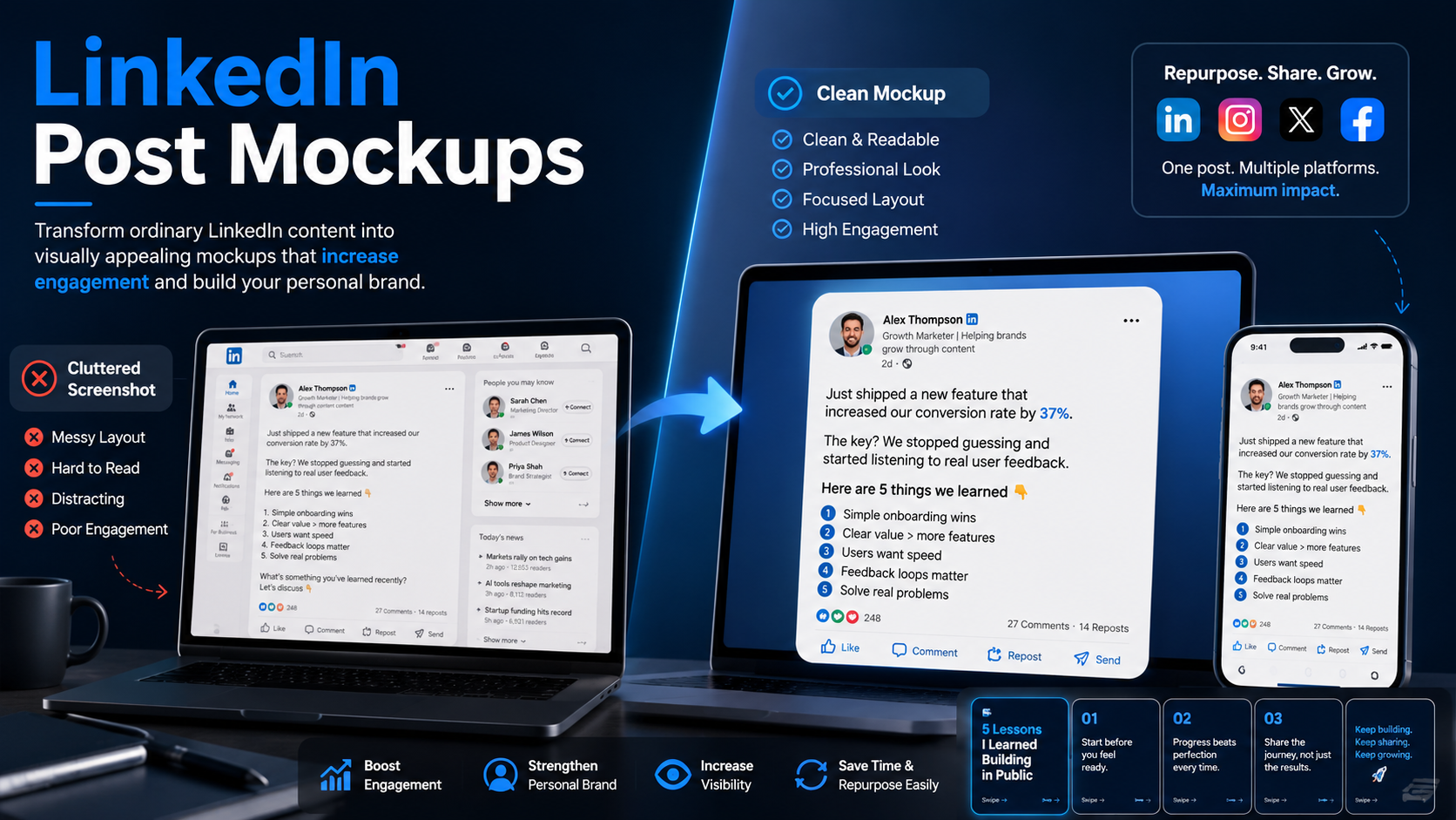
If you spend enough time on LinkedIn, you’ll notice that many creators and brands are no longer posting ordinary screenshots of their LinkedIn content. Instead, they are using clean, polished LinkedIn post mockups that instantly make the content feel more professional and visually appealing.
At first glance, this may look like just another design trend. However, there is a much bigger reason behind why LinkedIn post mockups have become so common recently.
People consume content extremely fast now. Attention spans are shorter, feeds are more crowded, and users scroll through dozens of posts within minutes. In that environment, presentation starts playing a much bigger role than before.
A plain screenshot often disappears into the feed because it feels cluttered and visually unorganized. A well-designed LinkedIn post mockup immediately creates structure and catches attention faster.
What is a LinkedIn post mockup?
LinkedIn post mockup is an example of a post on LinkedIn but made by recreating its interface in a more aesthetic manner. Unlike using just any ordinary screenshot taken straight from the website, users opt to create mockups as means of presenting their content in a better way.
Common elements in most mockups are the use of profile picture, layout, engagement icons and even post style. However, the design of everything becomes cleaner and more balanced.
Users commonly use LinkedIn post mockups to:
- Highlight top-performing posts
- Boost personal branding posts
- Highlight testimonials/announcements
- Promote educational content
As you might already understand, it all boils down to one thing; getting the post to be more noticeable when scrolling through pages.
Why LinkedIn post mockups work so well
The biggest reason is readability.
Most users consume content visually first and text second. A polished LinkedIn post mockup immediately creates a cleaner reading experience. It helps viewers understand where to focus their attention without feeling overwhelmed.
This matters much more today because people make scrolling decisions extremely quickly. If a post feels visually confusing, most users skip it within seconds.
Mockups reduce that friction.
A clean layout naturally improves:
- readability
- presentation
- visual hierarchy
- first impressions
without changing the actual content itself.
Why creators use LinkedIn post mockups on Instagram
This trend has grown rapidly because more LinkedIn creators are now repurposing content across platforms.
A normal LinkedIn screenshot usually looks messy on Instagram. The interface contains unnecessary distractions, and the formatting often feels visually dull inside Instagram feeds.
Mockups solve the problem by simplifying the layout and making the content feel more towards Instagram’s visual environment.
This allows creators to reuse LinkedIn content while maintaining a cleaner brand aesthetic.
Cross-platform repurposing has become much more important recently because creators no longer want to create completely different content separately for every platform. They want systems that help one idea work across multiple formats.
LinkedIn post mockups support that strategy very effectively.
What makes a good LinkedIn post mockup?
The best LinkedIn post mockups usually look simple.
One major mistake people make is overdesigning everything. Too many colors, effects, shadows, and decorative elements make the content harder to consume.
A strong mockup should feel:
- clean
- readable
- balanced
- visually organized
The design should support the content, not overpower it.
Spacing matters a lot. Readability matters even more. Most users will read these mockups on mobile devices, which means complicated formatting quickly becomes exhausting. A good LinkedIn post mockup should help someone understand the core idea within a few seconds.
Why readability matters more than aesthetics
A lot of creators focus too heavily on making content “look beautiful” while forgetting that the real goal is communication.
This leads to mockups that look impressive but are difficult to read.
Modern content consumption is extremely fast. People skim first and decide later whether something deserves deeper attention.
That is why successful LinkedIn post mockups prioritize:
- clean text placement
- strong hooks
- easy readability
- simple visual flow
instead of unnecessary visual complexity.
People engage more with content that feels mentally easy to consume.
Why LinkedIn post mockups work for content marketing
LinkedIn post mockups combine familiarity and presentation extremely well.
People recognize the LinkedIn-style layout, which then creates trust and familiarity and at the same time, the cleaner design improves the overall visual experience.
This makes mockups especially useful for:
- SaaS brands
- agencies
- coaches
- creators
- consultants
- personal brands
who regularly share educational or professional content online.
Mockups also help content feel more structured when repurposed into:
- Instagram posts
- carousels
- advertisements
- portfolio showcases
That flexibility is one reason the format has become so widely used.
Common mistakes people make with LinkedIn post mockups
One common problem is overcrowding the design with too much information. People try to fit entire essays into one visual, which immediately reduces readability.
Another issue is using fonts that look aesthetic but become difficult to read on mobile screens.
Some mockups also become overly corporate and lose all personality. People still connect more with human communication than overly polished branding.
The strongest LinkedIn post mockups usually feel natural, simple, and easy to process quickly.
How Instainker helps with LinkedIn post mockups
One of the biggest challenges with LinkedIn post mockups is not the design itself. The real challenge is creating content that feels structured and readable enough to work inside a visual format.
This is where Instainker becomes useful.
Instainker helps users:
- generate LinkedIn content ideas
- improve hooks
- structure posts more clearly
- simplify readability
- repurpose content into different formats
This makes it easier to create content that naturally fits into LinkedIn post mockups.
Instead of spending hours trying to figure out how to structure a post visually, users get a clearer content flow from the beginning. That becomes especially useful when turning LinkedIn posts into Instagram content, carousels, or mockup-based promotional creatives.
The goal is not simply to make content look prettier.
The goal is to make people stop scrolling long enough to actually read it.
Final thoughts
LinkedIn post mockups are becoming more popular because they match the way people consume content today.
Fast scrolling has made visual clarity much more important. Clean presentation improves readability, reduces friction, and helps strong content get noticed faster.
A mockup alone cannot save weak content. Strong ideas still matter most.
However, better presentation increases the chances of those ideas getting attention in the first place.
That balance between clarity, readability, and presentation is exactly why LinkedIn post mockups continue growing in popularity across platforms.
Related Articles
Start Creating Better LinkedIn Content
Use InstaInker to generate engaging posts tailored to your style.
Get Started Free